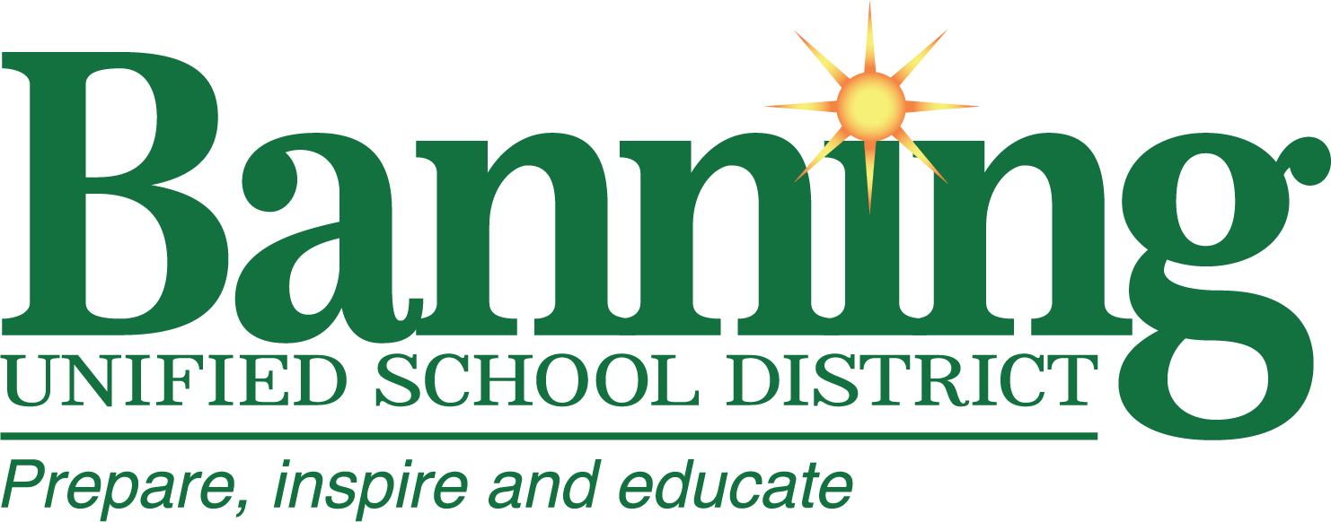
District Brand Style Guide
The Banning Unified School District Brand Style Guide serves as the foundation for maintaining a cohesive and professional visual identity across all communications. By adhering to the guidelines outlined in this document, staff and partners ensure that every communication reflects the values, professionalism, and pride of our District. From approved logo usage and official color palettes to typography standards and branding best practices, this guide empowers our community to present a unified image that inspires trust and strengthens connections.
Requesting Logo Usage
To maintain the integrity of our brand, all logo usage must be approved by the Communications Department. Whether it’s for event materials, promotional items, or digital media, requests can be submitted to communications@banning.k12.ca.us. Include the purpose, specific logo type, required file format, and deadline for your request.
Approved Logos
Our District logo is a vital symbol of our identity and professionalism. The Primary Logo is used in most communications, representing the District as a whole. The Tagline Logo incorporates our mission and vision, making it ideal for formal or strategic materials like reports or plans. The Brandmark is a simplified version of the logo that complements other designs but should never be used alone. Maintaining proper usage of these logos ensures we consistently present a strong and recognizable brand.
When using the logo, always maintain adequate spacing, use high-resolution files, and avoid altering its proportions, colors, or adding effects. For specific logo requests, contact the Communications Department for approval and appropriate files.
Official Colors
The District’s branding features three primary colors that reflect our identity:
Green: Represents growth and stability.
Orange: Reflects energy and creativity.
Yellow: Symbolizes optimism and warmth.
Accent colors provide additional flexibility and vibrancy in design, complementing the primary palette for both digital and print materials. Using these colors consistently helps reinforce our brand’s professional and cohesive image.
Typography Standards
Typography plays an important role in maintaining a consistent visual style. The District has a primary typeface for headers, titles, and body text. This font ensures a clean and professional look across all communications. By using the approved typeface, staff and partners can create materials that align with the District’s cohesive branding.
File Formats for Branding Materials
Different file formats are used for various purposes:
PNG: Ideal for digital platforms like websites, presentations, and social media.
JPEG: Best for printed materials that do not require transparency.
EPS/AI: Preferred for professional printing and large-scale projects, ensuring high resolution.
When requesting logo files, specify the format needed for your project to ensure optimal results.
